Friday, May 31, 2024

Earth Nose Game Champion 2024

Welcome to the 2024 Earth Nose Game World Championship! This year's event promises to be the most exciting and innovative yet, as players from around the globe gather to showcase their unique skills and compete for the coveted title of World Earth Nose Champion. Players in this year's competition will have to be at the very top of their nasal game as the 2024 Nose Game World Championship promises to be the ultimate challenge of nasal dexterity and nostril prowess!

The Earth Nose Game is a delightful fusion of technology and geography which leverages the power of TensorflowJS and FaceMesh to create an astonishing geography challenge. Using cutting-edge facial recognition technology, players need to identify locations around the world on an interactive globe - with their noses. To become the 2024 Earth Nose World Champion you will therefore need not only world-beating geographical knowledge but also a fine tuned and dexterous olfactory protuberance.

Seriously though - while the Earth Nose Game will give you a few minutes of fun it is also an impressive demo of how facial gestures can be used to navigate an online interactive map. There are potentially some very useful lessons to be learned from such experiments, particularly in making interactive maps more accessible for individuals who cannot use other navigational methods.

Thursday, May 30, 2024

Map Disco 2000

Apropos of nothing I present to you my Dancing Polygons!

This afternoon I asked ChatGPT to help me create interactive polygons from an isometric grid that I had created using turf.js. I wanted to give a click event to each diamond polygon shape in the isometric grid. However ChatGPT had other ideas and instead decided to create a series of irregular polygon shapes by connecting random intersections of my isometric grid.

I would have been disappointed except for the fact that I really liked the resulting pattern. So instead of asking ChatGPT to correct its mistake I decided to embrace the glitch and create Dancing Polygons. Every second this map (although there are no map tiles) creates a number of randomly shaped and colored polygons from an underlying isometric grid. 

I am not exactly sure why but I have also added the option to listen to a really annoying tune while you watch my dancing polygons (although it is much better in silent mode).

Are these are the safest streets in the world?

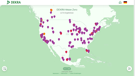
map of the United States showing those cities which have achieved Vision Zero in at least one year since 2009

Vision Zero is a global strategy aimed at eliminating all traffic fatalities. It is a vision built on the principle that the loss of life from road traffic accidents is unacceptable and preventable. Unfortunately many people believe that achieving zero road fatalities is impossible, especially in urban environments. The DEKRA Vision Zero Map not only shows that the Vision Zero goal is achievable it also shows you where that goal has been achieved around the world.

The DEKRA Vision Zero Map currently covers 26 countries in the world and lists all cities with more than 50,000 inhabitants in which no one has died in urban traffic in at least one calendar year since 2009. The color of a city's marker shows how many years since 2009 that city has had zero road fatalities. 

One of the aims of the Vision Zero Map is to make road safety visible. The map shows that many cities around the world are able to achieve zero road deaths, sometimes over many years. It is hoped that the map will help cities around the world learn from the most successful cities in order to get ever closer to a global Vision Zero.

Alongside the interactive map every year DEKRA awards one city the DEKRA Vision Zero Award. The 2023 DEKRA Vision Zero Award was won by the Swedish city of Karlstad. Karlstad has a population of over 60,000, and has still managed to have no traffic fatalities in eight of the past ten years. 

Sweden as a whole stands out on the Vision Zero Map for the safety of its city streets. Vision Zero as a policy was first formulated in Sweden and the country proves that eradicating road fatalities is achievable. Sweden has 27 cities with more than 50,000 inhabitants. Of those cities 24 have achieved zero road fatalities in at least one year since 2009. 

Wednesday, May 29, 2024

The Loss of the Great American Grasslands

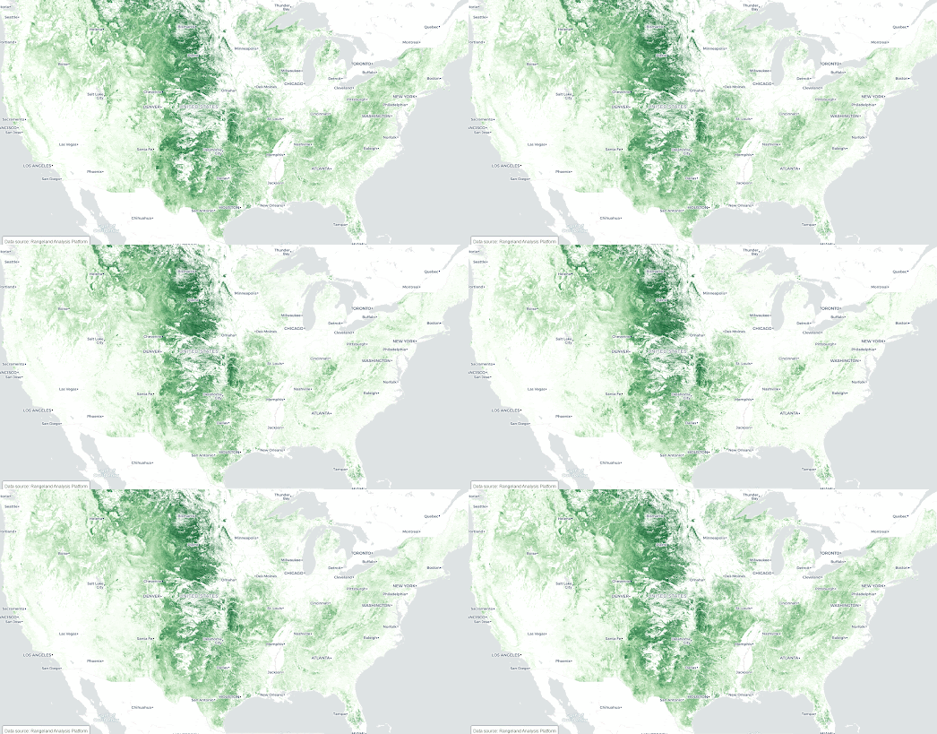
an animated GIF comparing a USA map of grassland coverage in 1992 ans 2021

The Cornell Lab of Ornithology and the Act for Grasslands. have teamed up to map the loss of grasslands in the United States. Over 2 million acres of American grasslands are lost on average every year. The result of which has a devastating effect on American wildlife. 

Using historical satellite records Map for Grasslands has tracked grassland loss in the USA over the last 30 years. By mapping and comparing grassland coverage across the United States in 1992 and 2021 Map for Grasslands is able to visualize the incredible extent of grassland loss in just the last three decades. Map for Grasslands has also created a small multiple visualization zooming in on the grassland loss in different regions of the United States. This visualization allows you to compare 1992 and 2021 grassland coverage in the Southeast, Midwest, West, and Northeast in more detail.

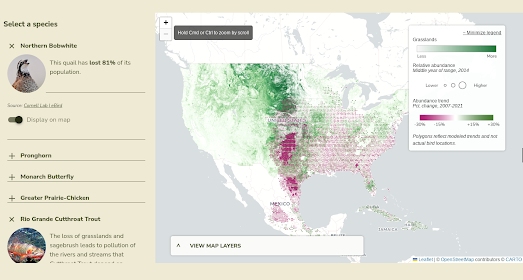
map of the USA showing the loss of range of the Northern Bobwhite quail superimposed on a map showing grassland loss

To help explain the effect that the loss of grassland habitats has on wildlife Map for Grassland has also used an interactive map to plot the loss of animal species ranges on top of this grassland loss. This map allows you to compare the loss of range of a number of different animals and birds. For example the screenshot above is a map visualizing the loss of range of the Northern Bobwhite quail superimposed on a layer showing grassland loss. You can see that the loss of grasslands in the Great Plains has had a devastating effect on the numbers of quail surviving in this region.

Via: Quantum of Sollazzo

Tuesday, May 28, 2024

The Death of Japantown

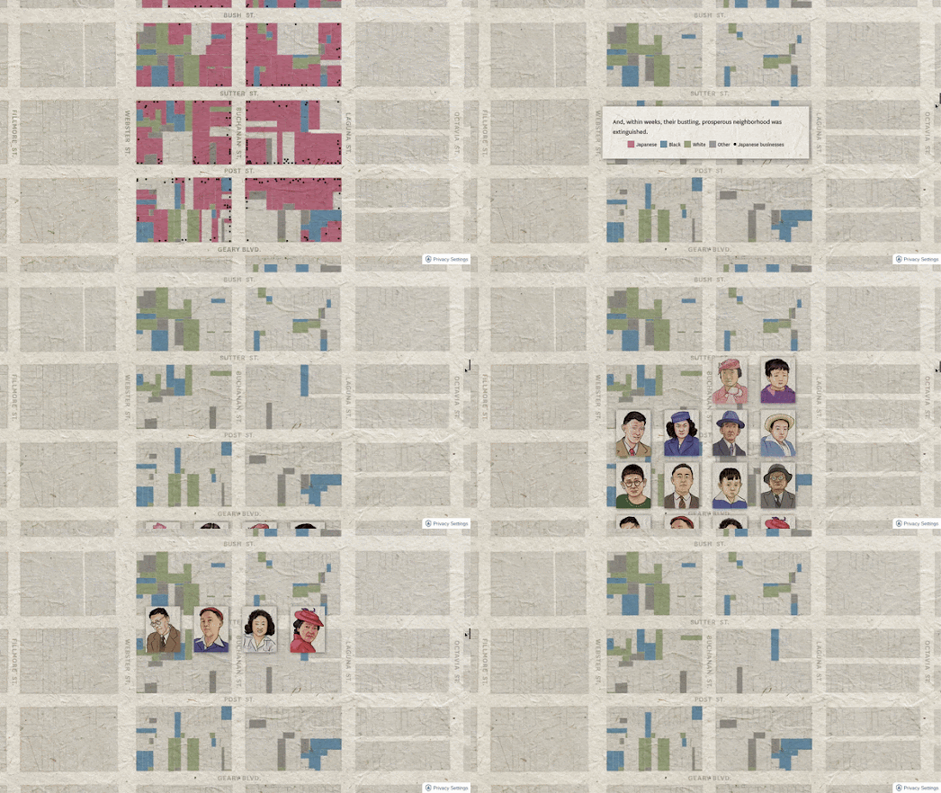
animated gif showing where houses owned by Japanes Americans in Japantown before & after internment

I'm a little late to this one but last month the San Francisco Chronicle published a superb story map documenting the effect of America's internment of Japanese American citizens in World War II on San Francisco's Japantown District.

Following the Japanese attack on Pearl Harbor in 1941, President Franklin D. Roosevelt signed Executive Order 9066. This order led to the forced removal and internment of Japanese Americans from the West Coast. Approximately 120,000 Japanese Americans were forcibly taken from their homes and sent to internment camps. During internment Japanese American families lost homes, businesses, and farms and many were forced to sell their property at a fraction of its value.

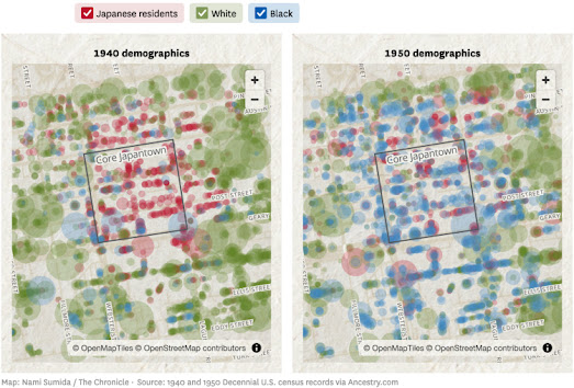
In Here's How SF's Japantown Was Devastated by Mass Incarceration the Herald has used historical census data to map out the racial mix of Japantown before and after World War II. In 1940 around 1,340 residents in the 20 square block of Japantown were of Japanese ancestry. In the 1950 census only around 730 Japanese people remained in Japantown.

side-by-side maps showing Japanese American owned homes in Japantown in 1940 and 1950
Detailed census records from the 1950 census were only released in 2022. So it is only now possible to accurately compare the number of Japanese American residents living in Japantown before and after the war. Alongside the huge reduction of Japanese American citizens there was a similar reduction in Japanese American owned businesses. According to the Chronicle's research there were 350 Japanese American owned businesses in Japantown in 1941. By 1952 there were only 200 remaining.

Monday, May 27, 2024

The Journey of a Vampire

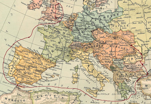
a map of Europe showing Dracula's route from Transylvania to England

On a dark night in July, 1893, Count Dracula embarked on a long, secret journey from Transylvania aboard the ill-fated ship Demeter. Unbeknownst to the unsuspecting crew of the Demeter, a malevolent force lay hidden in the ship's hold—a coffin filled with the cursed soil of Dracula's homeland, concealing the vampire lord himself.

By the time the Demeter's ghostly silhouette loomed over the shores of Whitby, it carried with it a cargo of death. The once bustling ship had become a floating tomb, with the captain, the sole survivor, lashed to the ship's wheel in a desperate bid to maintain control over the vessel. 

You can follow Count Dracula's nightmare journey from Transylvania to England for yourself on a new interactive book map of the novel. Dracula: The Map is a project by Morgan Bishop, which plots all the locations mentioned in Bram Stoker's Dracula. Using the 'Character Routes' drop-down menu you can select to view an interactive map of the journeys undertaken by each of the five main characters in the novel; Dracula, Jonathon Harker, his fiancee Mina Murray, Dr. Seward and Dr. Van Helsing.

The journey maps in Dracula: The Map were all created using Knight Lab's popular StoryMapJS format.

StoryMapJS was also used by the Smitsonian in Jane Austen's Footsteps to explore some of the important locations in the English writer's life. It has also been used to map Ayra's Journey in The Game of Thrones series of novels. Other maps of character journeys in fiction can be found in the Maps Mania post Literary Journeys.

Saturday, May 25, 2024

Old Maps Online

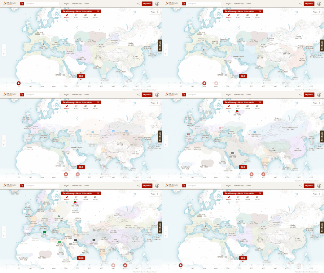
animated map of Europe showing changing country borders from 100 AD

Old Maps Online, MapTiler and the David Rumsey Map collection have launched TimeMap.org, a new interactive world map which allows you to explore the history of human civilization over the last 6,000 years. TimeMap promises to throw open the doors to the past, allowing you to explore bygone eras, trace the shifting boundaries of nations, encounter history's most powerful figures, and witness the battlefields that forged the world as we know it now.

You can also use TimeMap to browse over half a million vintage maps.

TimeMap has four main views: Regions, Rulers, People and Battles. The titles of these views are fairly self-explanatory: 

  • Select 'Regions' and you can use the timeline control to view the changing borders of countries and regions over time, since 4000 BC. 
  • Select 'Rulers' and the names of individual emperors, kings and queens and other important rulers are added to the map. These names obviously change as you change the date with the map's timeline control. 
  • The 'People' view is similar to the 'Rulers' view, except instead of rulers the map displays the names of notable individuals throughout history. 
  • Select 'Battles' and you can use the timeline and map to view the locations of military conflicts throughout history.

TimeMap also makes extensive use of Wikipedia to provide context for the 6,000 odd years of historical information which can be browsed on the map. In any of the the four main views you can click on any of the map labels (whether placenames, rulers, battles or notable individuals) to learn more from the relevant Wikipedia entry.

TimeMap is significantly enhanced by also providing access to over half a million vintage historical maps. Click on the 'Maps' button (top-right) and a sidebar opens showing you all the available historical maps for the current map view and selected year. You can then select any of these vintage maps to see it overlain on the main map.

These vintage maps provide snapshots of the world at different points in history. By layering these maps, TimeMap allows you to visualize how borders have changed, empires have risen and fallen, and cities have grown over time. The maps themselves are of course important historical artifacts. They reflect the cartographic knowledge and techniques of their time, so TimeMap also helps reveal the evolution of map-making alongside the evolution of human history itself.

Thursday, May 23, 2024

Guess This City - Daily Challenge

a blue square with the words Guess This City

Unveil the World with 'Guess This City': A New Daily Map-Based Game

Get ready to embark on a new global adventure from the comfort of your home with the launch of 'Guess This City,' a new daily map-based game. Every day brings a new test of your geographical knowledge and deduction skills as you are challenged to identify hidden cities by revealing parts of a map, one click at a time.

Discover the Game: How 'Guess This City' Works

'Guess This City' is a simple game that challenges players to guess the name of a hidden city by clicking on a concealed map. Each click reveals a small section of the map, offering hints and geographical clues about the city's identity. The objective is to guess the correct city in as few moves as possible, making each click a strategic decision.

How to Win

The Guess This City map uses very few place-name labels. Therefore your task is to identify the mystery city from the street grid and from the location of other features such as rivers, parks and bridges. Don't worry if you are struggling to identify the correct city as after every ten clicks a letter of the city's name is revealed!  

You can find more daily map challenges in the Maps Mania post the 12 Best Daily Map Games. You can also remix Guess This City and create your own daily map challenge game by remixing my game on Glitch.

Wednesday, May 22, 2024

It's War on the Streets of Paris

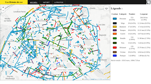
map of Paris with streets with military related names highlighted

Une Histoire de Rue is a new interactive map which explores the connections between Paris street names and military history. Around 15% of Paris' streets have names which are related to battles, soldiers and/or resistance fighters. This new interactive map allows you to quickly see the extent to which military history is reflected and commemorated in the names of Paris' roads.

On the map streets which have a name with a military focus are shown as colored lines. Streets which are named for important battles are colored green. The streets colored blue are named after generals and other important military figures. Heroes of the French resistance are commemorated in the streets colored red on the map.

As you explore the map you will find that certain districts of Paris have more militaristic sounding streets than others. For example the areas around the Arc de Triomphe (commissioned by Napoleon Bonaparte in 1806 after his victory at the Battle of Austerlitz) and the Bastille-Arsenal (the area around the former site of the Bastille fortress) both have a large concentration of streets bearing military related names.

Une Histoire de Rue (Street History) is also a website which allows you to create your own categories of street names. For example you can use Une Histoire de Rue to create your own map of Paris (or any other city) showing all the streets named for artists and writers. If you click on the 'Import' button you can load street data onto the map from a CSV file. You can then create your own categories of color-coded streets on the interactive map. The open-source code for the map is also available on GitHub.

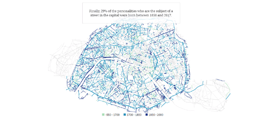
map of Paris with streets named for people highlighted

Le Figaro has also created a map of Parisienne street names. In particular it has examined how many Parisian roads were named for people and which historical periods those people are from. It then colored those roads on a map of Paris to show which historical period is most commemorated in Paris' roads.

In What Paris Street Names Reveal the newspaper says that a total of 2,500 streets in Paris are named for people. Only 15% of these roads are named for people born before 1700. One reason for this is that after the French revolution street names referring to the monarchy or Catholicism were banned. 1700-1850 is the most represented period in French history in the street names of Paris. 56% of streets in Paris named for people are named after figures from this historical period.

Le Figaro discovered that political figures were most likely to be commemorated by having a Paris street named for them. The next most commemorated group are writers, followed by military leaders.

Tuesday, May 21, 2024

99 Red Balloons Go By

Reuters reports that since December China has sent more than 100 balloons over Taiwan, often passing through air corridors used by civilian aircraft. It is unknown what the balloons are being used for, they could be weather balloons, but many suspect that they are being used to spy on Taiwan.

You may remember that in February last year many Americans became enraged by the presence of a Chinese balloon spotted over the United States. On that occasion the New York Times was able to use satellite imagery to work out the provenance of the balloon. In Tracking the Chinese Spy Balloon From Space the NYT was able to determine that the balloon had been launched from (or near) Hainan Island in China.

Reuters has now mapped out the flight paths of the balloons which have been spotted over Taiwan since December of last year. An animated scrollytelling map In Tracking China's 'grey zone' balloon flights over Taiwan visualizes the paths of all the possible Chinese spy balloons flying over the Southeast Asian island between December and April of this year.

The 'grey zone' reference in the Reuters headline hints at the news agency's take on the balloons as being used as gray-zone warfare, "designed to exhaust a foe using irregular tactics without resorting to open combat." Another data visualization in the Reuter's article shows that the balloons have been flying at much too low altitudes to be useful as weather balloons, indicating that they probably serve some other purpose.